How Important is a Book Cover
Trying to Solved My Book Cover Dilemma
If you are James Patterson, Steven King, or John Grisham, book covers probably don't really matter that much. As I have been working on the book cover for my third novel in the Jonas Watcher series, I have been sharing my cover choices and activities with other writers and readers. One woman sort of clarified the matter for me. She said that for unknown writers, the book cover was the first thing would draw her to a book. But if she saw the name of a writer she liked and read, the cover could be a brown wrapper and she would buy it as soon as she saw the author's name.
What that meant for me, an unknown writer, was that an intriguing Title and an engaging Cover were the two elements that I needed to have that would catch a reader's attention. Getting those tow things in front of eyes is another issue I hope to conquer.
A great title is subjective, and not the subject of this series of articles. Creating a cover is. I am not an artist, but I do know what I like. I have had positive feedback on the covers I have created, to be honest, I doubt I could create a cover for someone else, but I might be able to help others find the best solution that works for them.
As I am writing this series of articles, I am also in the midst of having a process in place to create the covers I want. So those of you following will get a first-hand account of success and failure. Hopefully, that will be useful to you.
For full disclosure, I am a self-published author. I use CreateSpace for my Print On Demand paperback books, and I use SmashWords and CreateSpace for eBooks, CreateSpace for Kindle on Amazon .com. I have used CreateSpace to generate Book Covers, using their basic templates. While they have created professional looking book covers, I had settled for less that I wanted. I am still new to this but in this article, I am going to walk through what I did and share my results both success and failure.
CreateSpace Book Cover Processing
 The image to the right is the opening screen from CreatsSpace and the user is offered two choices of book covers, either Matte or Gloss. I have used both and I prefer Gloss. This is a subjective option though you might do one of each and have someone else offer up opinions. The problem is that in order to really see what the image looks like on a book you need to buy a proof of each, which will cost you money. One of the options that I am going to try is to download the image and put it on photo paper both matte and glossy and see if it works. I will share my success in a later article of this series.
Book Covers for The Case of the Running Bag

 There were a number of book covers I had used for the first novel in the Jonas Watcher series. The earliest cover was the one on the right. Clearly the image is amateurish, the basic template is okay. The focus is on the series name and the title of the book is in the wrong place. My next attempt was better, the Series name and title are next to one another and I was happier with the results until I had some proofs run. Most of the image was darkened out. It has something to do with what you see online and what the printer actually put out. While the left image worked well for eBooks, it was a disaster for print books.
I went back to the CreateSpace drawing board.
 I started putting together covers that I liked, and I asked others what they thought. After a couple of weeks I had a pretty good consensus of what people thought and I selected the one out of group that worked for me and the majority of others. It wasn't exactally what I wanted but it worked for me. The story takes place in San Francisco circa 1930s and the running bag was in the image, and a shadowed image that reflected film noir. There were problems with the cover as far as title and subtitle, and ironically they exists even today, but I am getting ready to fix them.
  But the third cover also failed. I liked the overall feel for the book, so I came up with a new image and I lightened it for the physical cover of the paperback book.
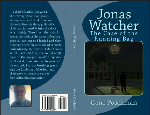
 This was the final selection that I made for the book and I re-released it. My main character is a PI, a picture of an office with a running bag and a colt 44 which is prevalent within the story.
The typeface is good, but again the series name takes the lead, and it may be that the book title should be the major point. My name is adequate, mostly because no one has heard of me. I think the cover is professional looking and I am interested in what other people might think. The good news is that I can create a better cover, and I am looking for feedback.
Before I close off this article I want to share a look of what CreateSpace provides for cover creation. I have been using the basic structure provided by CreateSpace and that is what I want to highlight here. I have since discovered that CreateSpace provides information for a more advanced process and that is what I will cover in the next article.
CreateSpace Cover Creator Walk Through
For now lets take a look at the CreateSpace basic Cover creator. The Screen below was provided after I selected a template that CreateSpace has about 5 pages of. The first option is theme which provides fonts, images, and default images. The only thing that was picked up from me was my book Series name, Title and Author name. I selected Shadowplay for the style and font.

The next thing I did was upload an image I created into the Front Cover image.

The next option I selected was to input text to the back of the book. My question for others is should this be biographical, a synopsis of the novel, or an excerpt of the novel. I would appreciate any feedback.

The next thing I did was upload an author's image,

Next I selected the main Background color, CreateSpace picked up the secondary color.

I didn't change the font color and I accepted the cover. Clearly what you see above was not the cover I had setup, I have not entered the back cover text, I would like feedback about that, and I am now going to make two other changes to see what people's opinions are. Again I am looking for feedback about what people think of the next cover I am going to create.

Using the basic cover provided in this template what do you think of this as a possible cover. With regards to the previous, or would you make even more drastic changes.
Keep in mind that I am going to explore using more advance options to create a book cover. I will also be going through the book to correct any errors, and release it as a new edition.
I hope my little journey into CreateSpace cover creator was of interest and please ask any questions I hope I can answer.
Gene Poschman


Comments
Post a Comment